
Get the look! Jennifer Aniston's eclectic library
- Jul 3, 2018
- 1 min read
While I was flipping through Architectural Digest's February issue, featuring Jennifer Aniston's stunning L.A. Midcentury home, my heart skipped a beat when I saw the stunning shot of her library. Her design team, including Stephen Shadley, created a comfortable space, with a great use of wood, bronze and textured layers. The Midcentury structural furnishings mixed with the glossy hue of the paint, silk rugs and antiques creates a harmony of new and old world. If I only had one word to describe the overall aesthetic, it would be exquisite.

Yes, yes, I know... we all wish we could get more than just the look of Jen Aniston's library! But, I have a great how to guide below to achieve a similar look for much less:
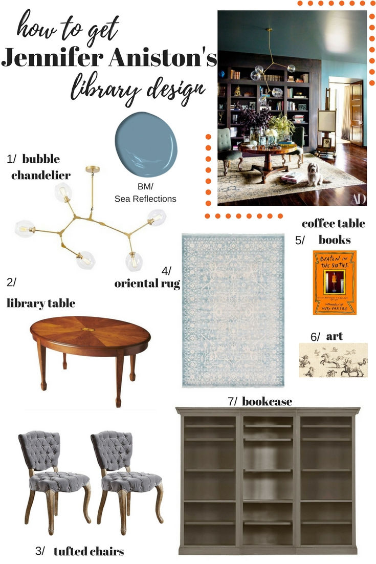
1// bubble chandelier 2// library table 3// tufted chairs 4//oriental rug
5// coffee table book 6// line art 7// grand bookcase
paint color: benjamin moore/sea reflections
Xx,
Jessica


https://xosoplus.mobi/ mình ghé thử cho biết vì thấy mọi người nói suốt, kiểu vào xem giao diện họ làm ra sao thôi. Lướt một vòng thấy họ chia mục theo ngày khá dễ hiểu, có đoạn ghi rõ XSMB ngày 19/07/2026 nên mình không bị lạc đang đọc phần nào. Mình thích nhất là cái bảng “Đầu Lô tô / Đuôi Lô tô” nhìn gọn, dạng cột nên quét mắt cái là nắm được, không phải căng mắt tìm. Cuộn xuống dưới cũng ổn vì các khối nội dung tách ra rõ ràng, không bị dồn chữ một cục. Nói chung cảm giác là trang này ưu tiên cho người xem nhanh, đặc biệt là khu bảng Đầu Lô tô/Đuôi…
GG88 mình thấy dạo này bị nhắc hoài nên cũng bấm vào coi thử cho biết. Không có ý định ngồi đọc hết nội dung đâu, chủ yếu xem giao diện với cách họ bố trí có dễ dùng không. Vào cái là thấy kiểu thiết kế khá gọn, nhìn hiện đại mà không bị rối mắt, nên người mới như mình cũng không bị lạc. Mình thích nhất là các mục được gom lại khá khoa học, kéo xuống một chút là hiểu trang đang nói gì, khỏi phải mò lâu. Bấm qua lại cũng nhanh, cảm giác thao tác mượt, không bị “đơ” hay giật. Nói chung nhìn ổn áp, kiểu tối giản nhưng vẫn rõ ràng, các…
https://keonhacai5.com/ mình ghé thử cho biết vì thấy bạn bè nhắc, kiểu vào xem giao diện thôi. Ấn tượng đầu là trang chia khối nội dung khá gọn, nhìn lướt không bị ngợp chữ. Mình có dừng lại ở bài Girona vs Athletic Bilbao (03h00 ngày 05/11), tiêu đề để nổi nên kéo xuống phát là thấy ngay, đoạn nhận định cũng ngắn gọn nên đọc nhanh hiểu ý. Mấy phần tỉ lệ/kèo trình bày theo cột, spacing thoáng nên không phải nheo mắt như vài site khác. Thanh menu đặt chỗ dễ thấy, chuyển qua lại giữa bài đang xem cũng mượt. Nói chung mình thích cách họ căn lề và chia box thông tin, nhìn sạch và dễ…
This was a pretty chill read tbh — it got to the point without turning into a wall of text, so I didn’t have to keep scrolling back to figure out what it meant. I liked that it actually explained the reasoning behind the tips instead of just tossing out a checklist. Halfway through I ended up clicking around newimage.io for a bit since it has that same “helpful but not preachy” vibe when you want to go one step deeper. Everything felt written by someone who’s actually tried this stuff, not just rewording the same generic advice you see everywhere. Also, the way the page is set up makes it easy to skim, with clear headings and short paragraphs…
Hi Jessica
Jennifer Aniston library is fab! I'm trying to paint a room the exact colour & you mention Benjamin Moore Sea reflections., do you know if that was the colour she used or is that a guess. I have also heard that West Coast was the colour. If you can help that would be great.
Lynn x